Coach
New York – January 2020
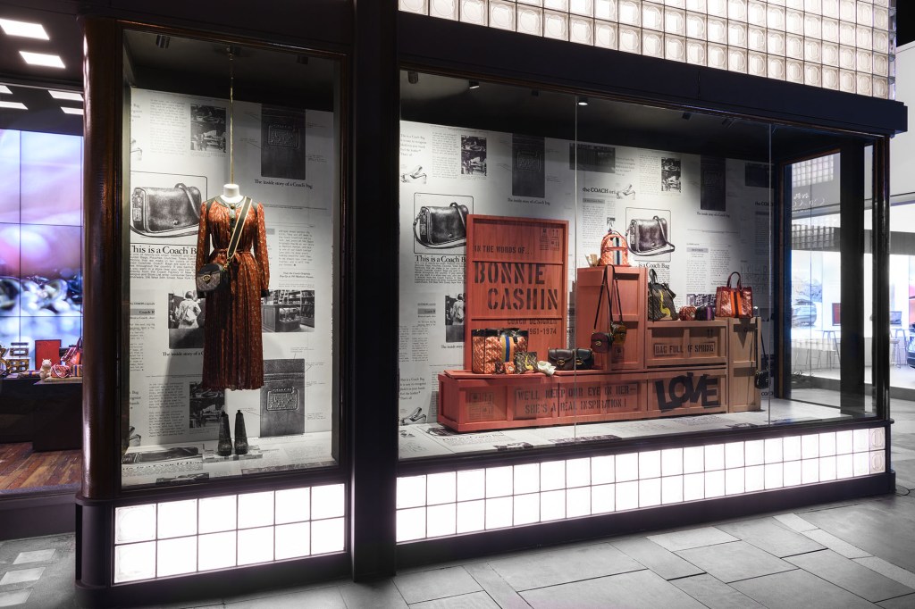
This window display is celebrates their as well as one of Coach’s earliest and most influential designers Bonnie Cashin. My eyes were instantly drawn to the big text on the front box which made me want to know more. Cashin led in forwarding Coach’s design elements on their handbags by trying new materials. This display is showing the viewer Coach’s newest bags for the season and uses it’s brand history to communicate that Coach is a timeless and creates quality handbag. This display utilizes primarily earthtones colors and neutrals. The main burnt orange color used stands out from the newspaper backdrop. The colors and use of the backdrop helps in making this old-school, new-school message communicate itself visually. While the display is asymmetrically balanced it works. The mannequin to the left stands out on its own while still being connected with the boxes and handbags in the right window. I think this display is visually appealing and also stirs up interest in Coach’s brand history. Overall, I think the display is very effective.
Versus Versace
New York – February 2020
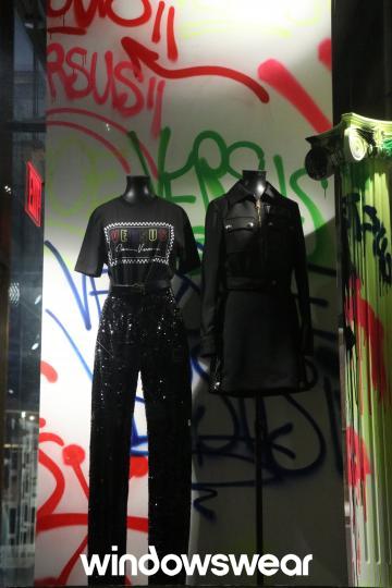
While I enjoy parts of this display overall I think it is lacking visually. I don’t like the asymmetry of the display. The mannequin on the left pulls the eye top to bottom while the one next to it only brings the eye halfway down. It feels a little too simple and somewhat boring I feel like three mannequins would’ve been better and more props should’ve been used; creating more of a story through the styling. Using more props the merchandiser could’ve created more of a sense of direction and flow. I think the graffiti background is interesting and adds a great pop of color in the viewing of the black clothing. It would’ve been interesting to see these colors used more within the display, maybe even through the lighting. This is not a horrible display but I think more elements could have been used to make it more interesting and communicate better with the audience.
