For this blog post I want to analyze stores with which I had no prior knowledge on anything relating to their brand making my analysis less bias.
Unknown store
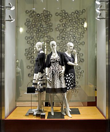
I think this display is working well in a lot of ways. Firstly, i really enjoy that the mannequins are in three. Personally, i think grouping in three fill the space, give good repetition and balance while not making it overcrowded. It gives the viewer three different but similar outfits to gaze upon while also giving different points of view. These different views allow the viewer to pick up on specific design details and further gain interest in the products. While these outfits aren’t necessarily my style I can tell who this brand’s target market is, probably 40-50’s aged women give or take. The brand is using neutral colors appealing to their customer who wants toned down, somewhat conservative yet cute outfits. I think various neutral colored circles in background tie well with the circles on the mannequins skirt. Overall, the display works very well visually.
Unknown Store
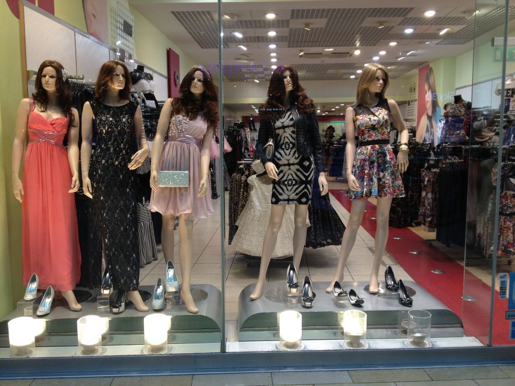
This display could use some work. I can’t tell what the story or theme of this is besides prom dresses. Not sure if that is what this store was looking to communicate but it doesn’t say much to the viewer, only that they sell prom dresses. I don’t think the mannequins enhance the display either. I think they look a little off putting and creepy. I also think they should’ve been styled in colors in the same color group. This would have made it more visually appealing.
