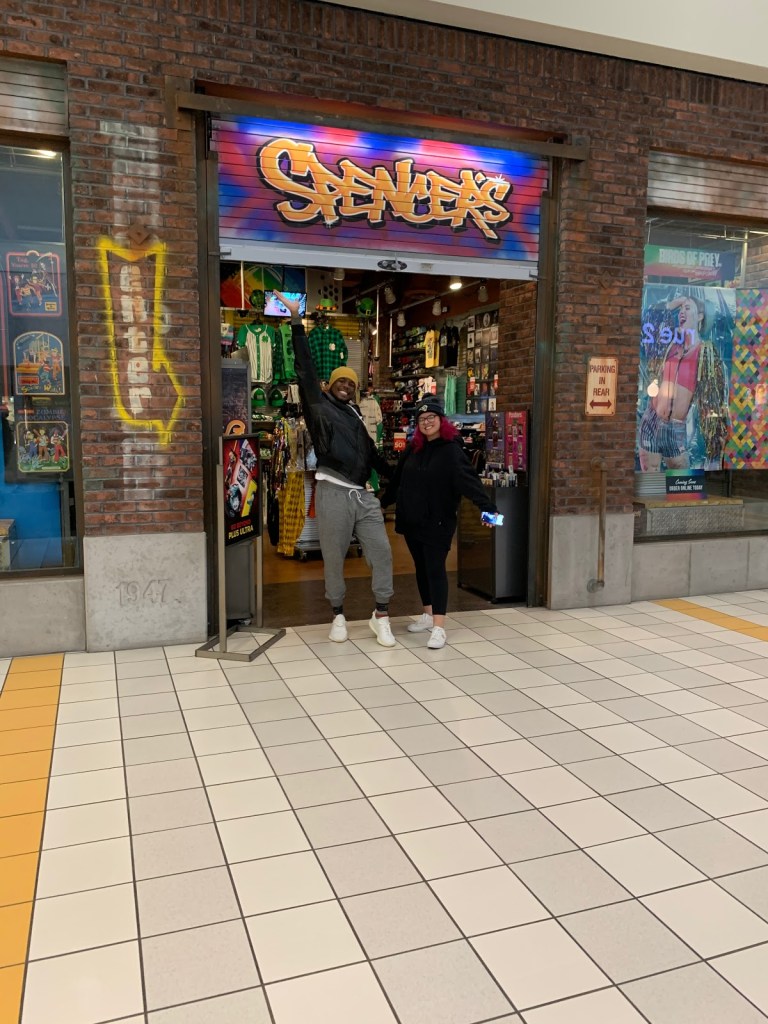
For this project instead of visually analyzing store displays seen online my classmate and I went out and evaluated one at the mall. The store we chose was Spencer’s at Eastland Mall in Bloomington, IL.
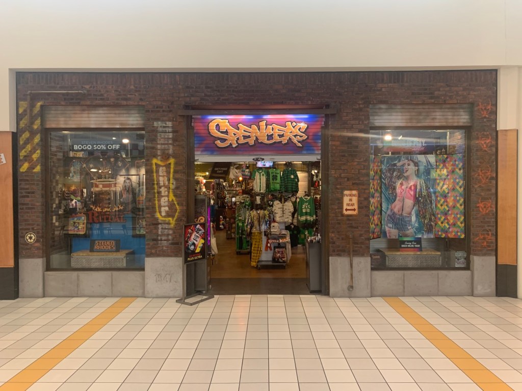
Atmospheric Elements used in the store:
- Design Elements used:
- Space: The floor layout utilizes most of the store space leaving space for shoppers but not overly spacious.
- Color: Dark, neutral colors used throughout the interior and fixtures. Using a neutral tone palette allows for their merchandise to stand out and not clash with the store appearance
- Direction: The merchandise in the store reaches vertically from floor to ceiling which leads shoppers from one part to another part. The layout of the fixtures also give a sense of direction within the store.
- Principles of design used:
- Informal Balance: Each side of the store contains relatively similar amounts of merchandise and compliments the other.
Summary of Visit:
Overall, we like how the store is but we think they could use more design elements and graphics to elevate the inside of the store. Spencer’s is a store where it can be easy to get overwhelmed by the amount and variety of merchandise so something to engage with the customer as they shop around.
