Rustic window display
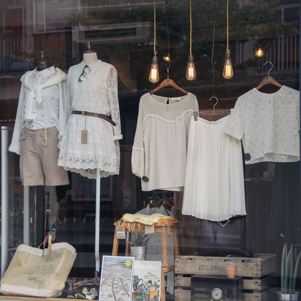
I think this display is working very well. The store obviously is more rustic and simplistic yet chic. I think the store is doing a great job at targeting their consumers. Their consumer is someone who likes to dress simple but cute has free spirit that enjoys being in nature. While all the garments are primarily white they have different textures which creates visual interest. I like the way the three garments to the left are hung and arranged in a jagged formation. It makes the garments more interesting to look at and the grouping of three garments matching the three lights in the background. I also like that the two mannequins are on slightly different levels. I think a handbag stand would’ve been nice instead of laying the tote on the ground, and stuffing it to make it appear full. I think the books and plants help in portraying the naturalistic and free spirited theme of the display. Overall, I think all components of the display are cohesive and create visual interest.
Bad Boy In
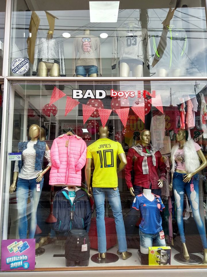
I think this display could use some assistance. It is very busy and it’s hard to figure out where to look. Including all sorts of looks and types of mannequins makes the display visually unappealing. Obviously, they have a ton of merchandise but i think styling the mannequins could have been better. I think the visual merchandisers should’ve gone with more of a sports theme because of the mannequin in the center. It would have made the display more interesting and not as chaotic. I also don’t thinking the hanging decoration helps the display it just distracts more. This display just has too much going on and its message is unclear.
