Featured

All About Me

“Building My Brand Identity”

Hi, my name is Emily Echevarria and I am currently a senior at Illinois State University studying both Art and Fashion Merchandising. For as long as I can remember I’ve loved to express myself through art and from a young age realized it was my passion. I became heavily involved with my high school’s advanced art program creating wearable art and displaying my work in shows. I made connection with ISU through one of these art shows and decided that I would go to ISU to further my studies and career as artist. I chose to study art concentrating in metalwork and jewelry design and later added fashion merchandising.

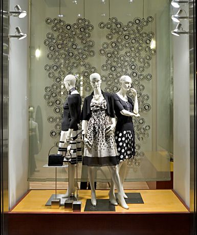
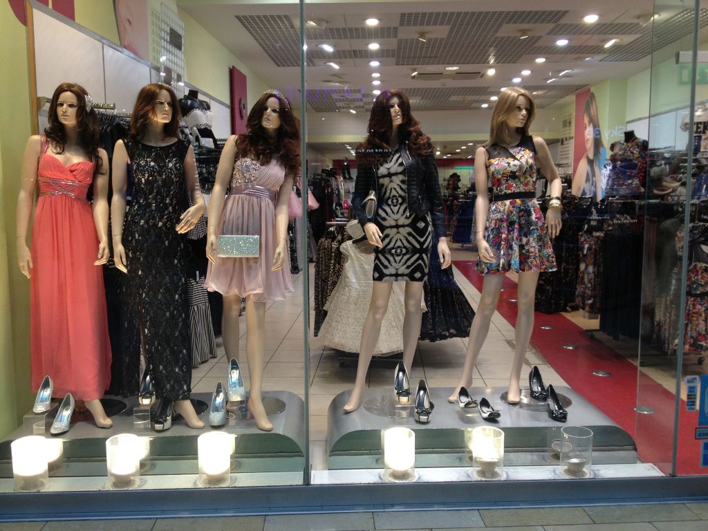
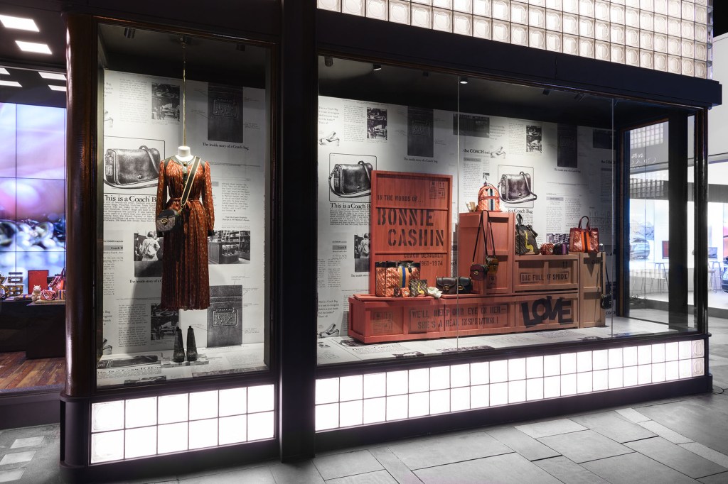
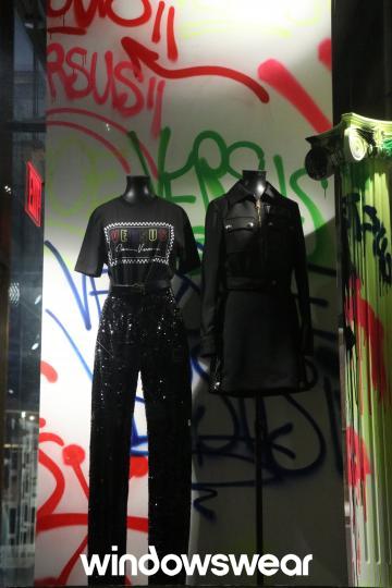
I consider myself a creator. I’m at my best when I’m thinking, designing and creating my ideas. I’m a very creative person who constantly is thinking of new ideas for art and design projects. While working in retail I’ve learned so much about consumers, sales, customer service, visual merchandising and management. I’ve worked in management positions leading a team to succeed in sales, merchandising and maintaining a store. These are skills I will carry with me into my future career as a fashion professional.

Career-wise I’ve always wanted to be my own boss someday. I’ve always dreamt of being the creative director and owner of my own fashion brand; using my creativity and art to develop and maintain my own brand’s image and aesthetic. That is my end goal, but I want to gain lots of experience working in the industry as a merchandiser, designer, stylist or anything dealing with creativity and design. I’ve worked in retail all my life and have developed an eye for visual merchandising because of it. I want to work in a creative environment that can teach me sides of the industry I’ve yet to experience. There are endless opportunities in the world, and I can’t wait for my hard work to pay off and to see my dreams become reality.

Visual Merchandising Analysis #4

Rustic window display

I think this display is working very well. The store obviously is more rustic and simplistic yet chic. I think the store is doing a great job at targeting their consumers. Their consumer is someone who likes to dress simple but cute has free spirit that enjoys being in nature. While all the garments are primarily white they have different textures which creates visual interest. I like the way the three garments to the left are hung and arranged in a jagged formation. It makes the garments more interesting to look at and the grouping of three garments matching the three lights in the background. I also like that the two mannequins are on slightly different levels. I think a handbag stand would’ve been nice instead of laying the tote on the ground, and stuffing it to make it appear full. I think the books and plants help in portraying the naturalistic and free spirited theme of the display. Overall, I think all components of the display are cohesive and create visual interest.

Bad Boy In

I think this display could use some assistance. It is very busy and it’s hard to figure out where to look. Including all sorts of looks and types of mannequins makes the display visually unappealing. Obviously, they have a ton of merchandise but i think styling the mannequins could have been better. I think the visual merchandisers should’ve gone with more of a sports theme because of the mannequin in the center. It would have made the display more interesting and not as chaotic. I also don’t thinking the hanging decoration helps the display it just distracts more. This display just has too much going on and its message is unclear.

Fashion Promotion Choice Presentation

For this project instead of visually analyzing store displays seen online my classmate and I went out and evaluated one at the mall. The store we chose was Spencer’s at Eastland Mall in Bloomington, IL.

Storefront does a good job at enticing new shoppers. Both store window contain posters for trendy and licensed merchandise. Uses graffiti design to give a funky, industrial look which the brand sees as a “downtown club look”.

Atmospheric Elements used in the store:

  • Design Elements used:
    • Space: The floor layout utilizes most of the store space leaving space for shoppers but not overly spacious. 
    • Color: Dark, neutral colors used throughout the interior and fixtures. Using a neutral tone palette allows for their merchandise to stand out and not clash with the store appearance 
    • Direction: The merchandise in the store reaches vertically from floor to ceiling which leads shoppers from one part to another part. The layout of the fixtures also give a sense of direction within the store. 
  • Principles of design used:
    • Informal Balance: Each side of the store contains relatively similar amounts of merchandise and compliments the other. 

Summary of Visit:

Overall, we like how the store is but we think they could use more design elements and graphics to elevate the inside of the store. Spencer’s is a store where it can be easy to get overwhelmed by the amount and variety of merchandise so something to engage with the customer as they shop around.

Visual Merchandising Analysis #3

For this blog post I want to analyze stores with which I had no prior knowledge on anything relating to their brand making my analysis less bias.

Unknown store

I think this display is working well in a lot of ways. Firstly, i really enjoy that the mannequins are in three. Personally, i think grouping in three fill the space, give good repetition and balance while not making it overcrowded. It gives the viewer three different but similar outfits to gaze upon while also giving different points of view. These different views allow the viewer to pick up on specific design details and further gain interest in the products. While these outfits aren’t necessarily my style I can tell who this brand’s target market is, probably 40-50’s aged women give or take. The brand is using neutral colors appealing to their customer who wants toned down, somewhat conservative yet cute outfits. I think various neutral colored circles in background tie well with the circles on the mannequins skirt. Overall, the display works very well visually.

Unknown Store

This display could use some work. I can’t tell what the story or theme of this is besides prom dresses. Not sure if that is what this store was looking to communicate but it doesn’t say much to the viewer, only that they sell prom dresses. I don’t think the mannequins enhance the display either. I think they look a little off putting and creepy. I also think they should’ve been styled in colors in the same color group. This would have made it more visually appealing.

Visual Merchandising Analysis #2

Coach

New York – January 2020

Courtesy of WindowsWear

This window display is celebrates their as well as one of Coach’s earliest and most influential designers Bonnie Cashin. My eyes were instantly drawn to the big text on the front box which made me want to know more. Cashin led in forwarding Coach’s design elements on their handbags by trying new materials. This display is showing the viewer Coach’s newest bags for the season and uses it’s brand history to communicate that Coach is a timeless and creates quality handbag. This display utilizes primarily earthtones colors and neutrals. The main burnt orange color used stands out from the newspaper backdrop. The colors and use of the backdrop helps in making this old-school, new-school message communicate itself visually. While the display is asymmetrically balanced it works. The mannequin to the left stands out on its own while still being connected with the boxes and handbags in the right window. I think this display is visually appealing and also stirs up interest in Coach’s brand history. Overall, I think the display is very effective.

Versus Versace

New York – February 2020

Courtesy of WindowsWear

While I enjoy parts of this display overall I think it is lacking visually. I don’t like the asymmetry of the display. The mannequin on the left pulls the eye top to bottom while the one next to it only brings the eye halfway down. It feels a little too simple and somewhat boring I feel like three mannequins would’ve been better and more props should’ve been used; creating more of a story through the styling. Using more props the merchandiser could’ve created more of a sense of direction and flow. I think the graffiti background is interesting and adds a great pop of color in the viewing of the black clothing. It would’ve been interesting to see these colors used more within the display, maybe even through the lighting. This is not a horrible display but I think more elements could have been used to make it more interesting and communicate better with the audience.

Visual Merchandising Analysis #1

Dior Window Display

January 2020 in London

Courtesy of WindowsWear

This display is being used to showcase Dior’s latest Resort 2020 collection. This collection pulls inspiration from the Moroccan city of Marrakesh. The display utilizes a large backdrop that covers all the walls and floor of the display. The backdrop uses primarily indigo, yellow and white to create a lush scenery of a jungle scene filled with nature motifs and animals.These colors create a unity and harmony between the backdrop and the clothing items displayed. The style of the backdrop creates a woven texture that perpetuates a comforting and relaxing yet elevated look . The props used are simple in form but also utilize the woven style backdrop while creating a sequence the viewer’s eye can follow throughout the scene. Some may say this display is too busy but I think that was an intentional move. Visual merchandisers who created this display clearly wanted viewers to be enveloped in rich culture of Marrakesh imagining themselves in the clothing and as a part of the Gucci brand image.

NorthFace Window Display

Source Unknown

This store display is severely unappealing. While the location is unknown whomever designed this display should’ve reevaluated it. Instantly what bothered me is the clutter. There is no empty space throughout the display making it hard for the viewer to find where and what to look at. It seems like there is no message that is trying to be communicated because of all the different signs within the window. The only principle of design that is identifiable is repetition through the use of the three mannequins. These are the only part that seems thought out and they still lack in styling. There is no apparent theme and the props used are not working. The display does nothing to enhance the NorthFace brand image and simply shows that this store has a surplus of backpacks that just had to be thrown in the window.

Design a site like this with WordPress.com
Get started